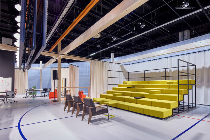
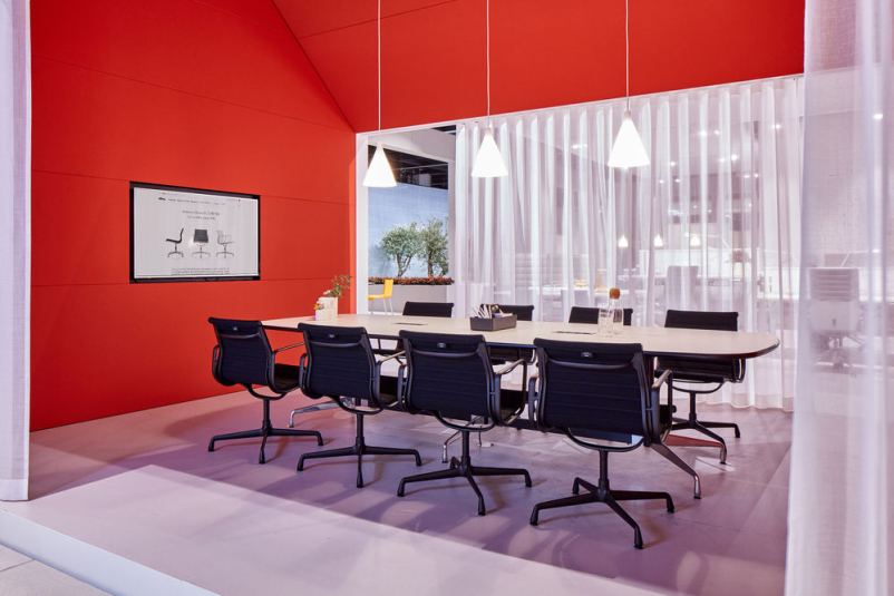
During Orgatec 2018 Vitra presented one of the largest exhibition spaces. It provoked questions regarding the purpose of such a large presentation and, above all, the future of office design. How will space be understood? What will be the role of architect and designer?
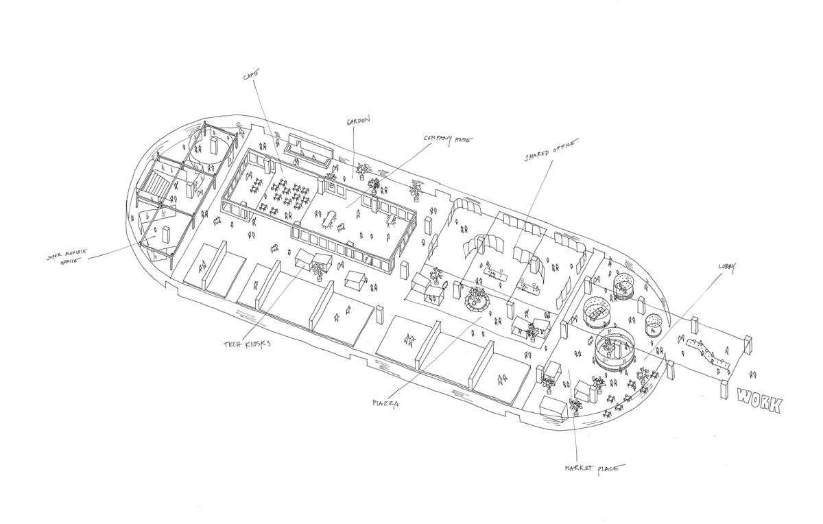
WORK 2018 - szkic ekspozycji Vitry, autor: Pernilla Ohrstedt
We have recently written that a change of thinking about designing space (not only office space) turned out to be more important than new products. Vitra’s presentation had one, very complex objective: to show the increasing osmosis of workzones into public space and vice versa. Flexibility and ability to adapt are key values in the work place. They apply not only to employees but also to space design.
We work everywhere, not only in the office. In parks, cafes, during commute, in airport or railway station waiting rooms. At the same time, the office includes functions hitherto typical for public spaces: parks, common zones.
It’s not an accident that Vitra’s installation is called “Work” rather than “Office”. –Office is merely a tool which reacts to how people work – explains Jonathan Olivares, who designed the space together with Pernilla Olivares, in an interview for StylePark.
The goal of designers is to create collages which take into account diverse needs while maintaining consistency and unity, for example by means of conscious material or colour choices. Let’s take a closer look at three scenarios prepared by Sevil Peach, Barber & Osgerby and Konstantin Grcic.
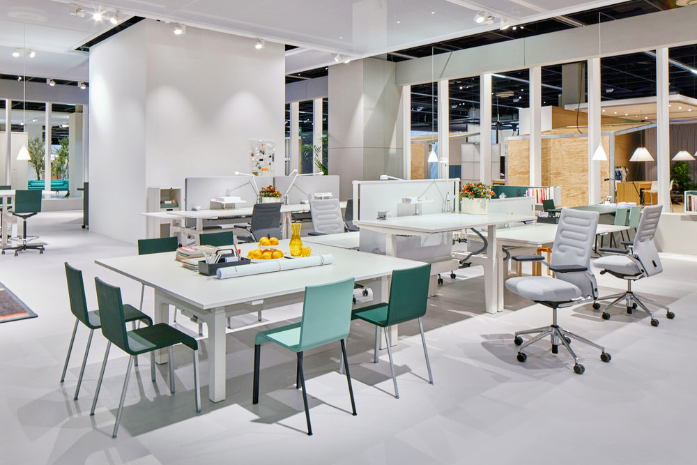
Vitra, Company Home (Sevil Peach, Orgatec 2018)
Scenario 1: Company Home
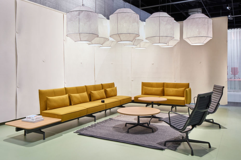
– When you work on an office project, the important thing is to capture the spirit of the company. If you manage to do this, you can be sure that you’re on the right path to create a good interior – says British architect Sevil Peach. Her vision of the future can be described as the most conservative. It’s a space, for instance a corporate HQ, where company values are reflected in the interior. Architecture, materials used and the selection of furniture make for a harmonious work environment. The employees can choose between zones which correspond to different needs: concentration during individual work, rest or meeting with other team members. Office park complements Peach’s vision.
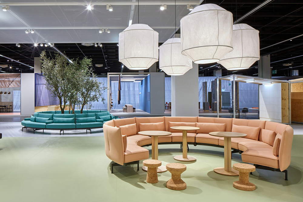
Vitra, Shared Office (Edward Barber i Jay Osgerby, Orgatec 2018)
Scenario 2: Shared Office
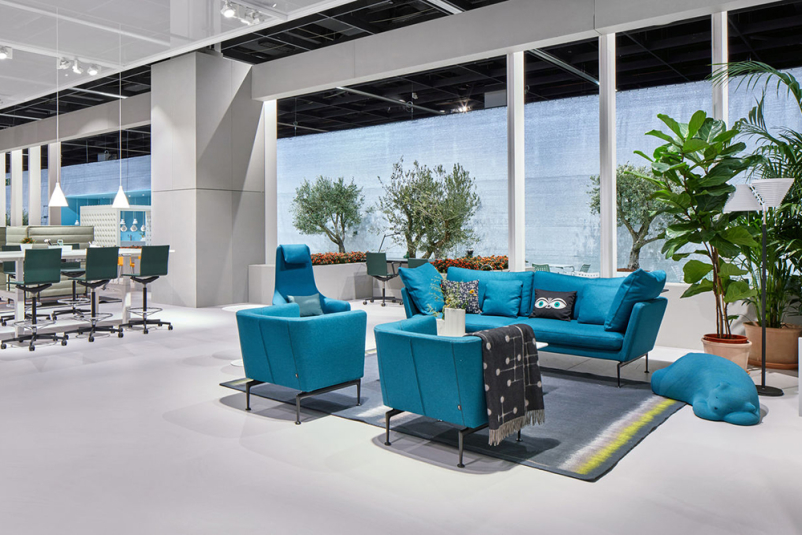
Designers Edward Barber and Jay Osgerby believe that the desk archetype is disappearing. Contemporary cities are promoting new, public work environments. Coworking spaces, cafes, hotel lobbies – these spaces are now changing the relationship between urban space and what has traditionally been perceived as “interior”. Similarly, building managers increasingly often make ground floor available to non-employees.
In coworking spaces the importance of a classic desk is waning. Instead, increasingly popular are sofas (with built-in sockets and stools making it easier to use mobile devices), easily movable tables and acoustic screens, allowing for private conversations.
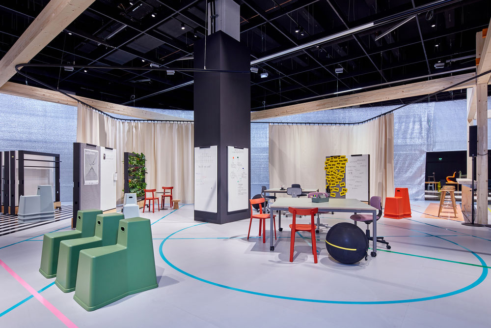
Vitra, Super Flexible Office (Konstantin Grcic, Orgatec 2018)
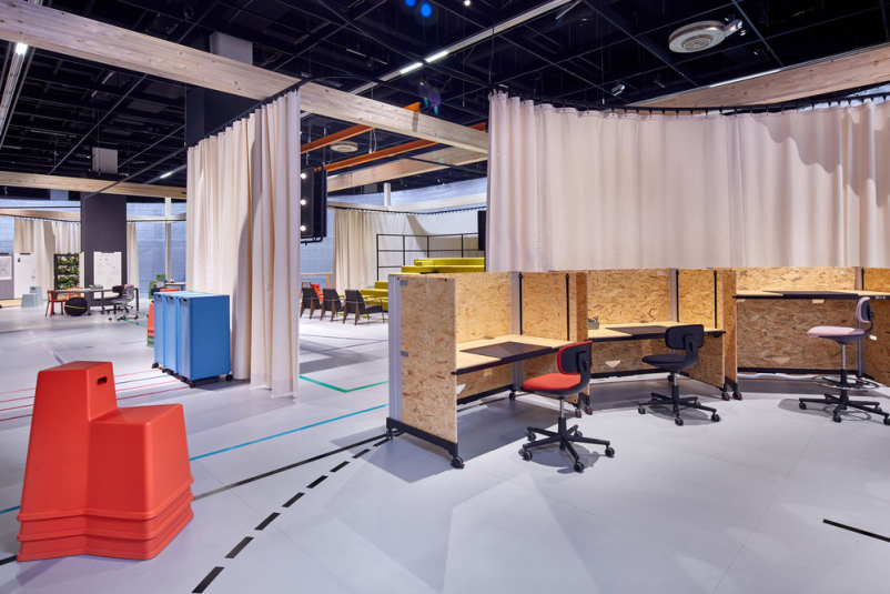
Scenario 3: Super Flexible Office
Konstatntin Grcic’s vision involves a greater degree of elasticity with regards to office space. Office can be frequently and efficiently rearranged while retaining its identity. What counts are creativity, good communication and ideas exchange. In a so called agile office users of a space can easily adjust it to their current needs. They are aided by furniture on castors, mobile screens, stackable chairs and new products: multifunctional partition Dancing Wall (designed by Stephan Hürlemann) and Rookie, a “surprisingly simple” office chair (designed by Konstantin Grcic). It’s a perfect space for startups which often adhere to the notion that change is the only constant.
The office concepts were suplemented by new furniture models, and reeditions of some old classics.
Photos: press materials, Eduardo Perez.
